Waterfall Chart
A waterfall chart shows the running total as values are added or subtracted categories impacting the final total.
Properties
Series
The Series property expects a JSON object which:
- describes how deltas in the Waterfall chart should be colored
- provides data for constructing the bars in the waterfall chart.
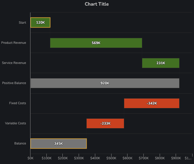
Consider the following chart:
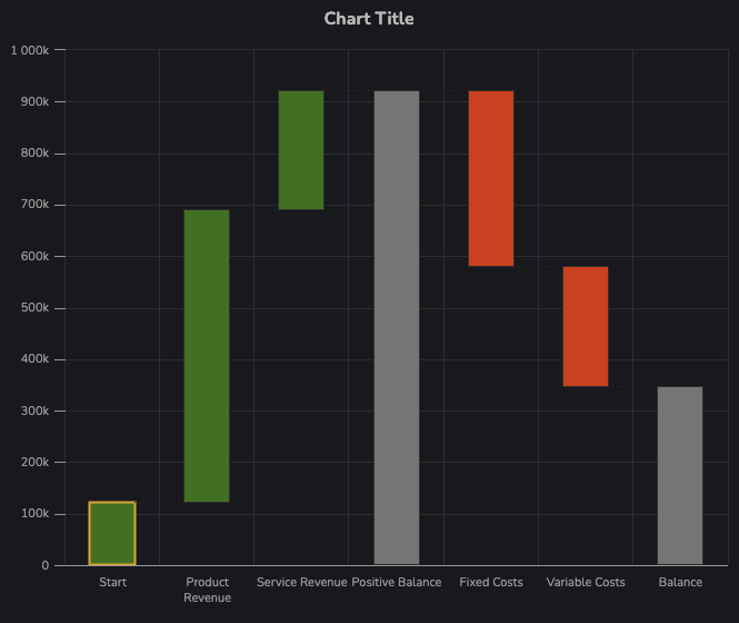
The above chart was produced with the following configuration:
{
  "positiveColor": "green",
  "negativeColor": "red",
  "data": [
    {
      "name": "Start",
      "y": 120000,
      "borderColor": "orange"
    },
    {
      "name": "Product Revenue",
      "y": 569000
    },
    {
      "name": "Service Revenue",
      "y": 231000
    },
    {
      "name": "Positive Balance",
      "isSum": true,
      "color": "grey"
    },
    {
      "name": "Fixed Costs",
      "y": -342000
    },
    {
      "name": "Variable Costs",
      "y": -233000
    },
    {
      "name": "Balance",
      "isSum": true,
      "color": "grey"
    }
  ]
}
Data
data is an array of objects describing the bars to make:
A datum of the following form will produce a delta in the chart:
{
  "name": "Start",
  "y": 120000
}
Whereas a summation bar (of any color) can be constructed by providing an element positioned within the array (i.e. not the first or last element) with the property isSum being true:
{
  "name": "Positive Balance",
  "isSum": true,
  "color": "grey"
}
Finally, the last element in the data array should always be describing a summation bar:
{
  "name": "Balance",
  "isSum": true,
  "color": "grey"
}
Other Series Configuration Items
In addition to the data property, the following configuration items are supported at the base level of the series object:
positiveColor,negativeColor,sumColor: A color to use for each type of bar, respectively. Note that when colors are provided per datum in thedataproperty, that color is used instead.positiveBorderColor,negativeBorderColor,sumBorderColor: A color to use for the border of each type of bar, respectively. Similarly to color, this can be overridden per bar by use of theborderColorproperty (for a single datum).
Title
(optional)
The title text to be displayed above the chart.
Title Align
(Optional)
How the title should be aligned. Supported values:
leftcenterright
(X / Y) Axis Title
(optional)
Text to be displayed on either axis.
Enable Tooltip
(optional)
A flag that indicates whether a tooltip should appear when hovering over series on the chart.
Defaults to true
Tooltip Config
(optional)
Tooltip config accepts a ValueFormatSpec (see Appendix 1: Value Format Spec) object that will be applied to the y values in every series. For example, the following configuration:
{
  "prefix": "$",
  "suffix": " / unit",
  "multiplier": "1",
  "dp": 0
}
Will produce the following tooltip:

Y Axis Format
Y Axis Format expects a ValueFormatSpec object (see Appendix 1: Value Format Spec) to define how ticks along the y axis are formatted in the chart.
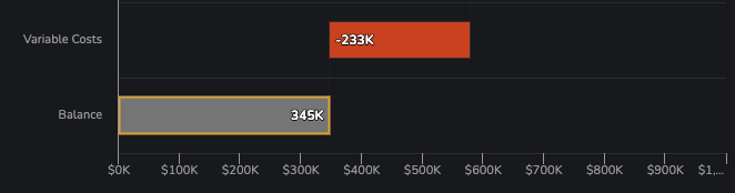
As an example, the following configuration:
{
  "prefix": "$",
  "multiplier": "k"
}
Will produce the following y-axis ticks:
Show (X / Y) Axis
(optional)
Show X Axis and Show Y Axis are flags which control the visibility of the axes.
Defaults to true for both axes (i.e. visible)
Y Axis Range
(optional)
An tuple of length two that defines the range of the axis. For example, the following configuration will constrain an axis' values between 0 and 100:
[0, 100]
In the case where the creator wishes to specify only an upper or lower range on an axis, the string auto may be supplied for the bound whose value is inconsequential. For instance, an upper bound of 100 on an axis may be specified like so:
["auto", 100]
Invert Axes
(Optional)
Inverts the axes of the chart such that x values are displayed vertically and y values are displayed horizontally.
Defaults to false
(X / Y) Grid Lines
(Optional)
Flags that specify whether the faint gridlines distributed evenly behind the series are visible.
In the following picture, only the Y Grid Lines are visible (true):
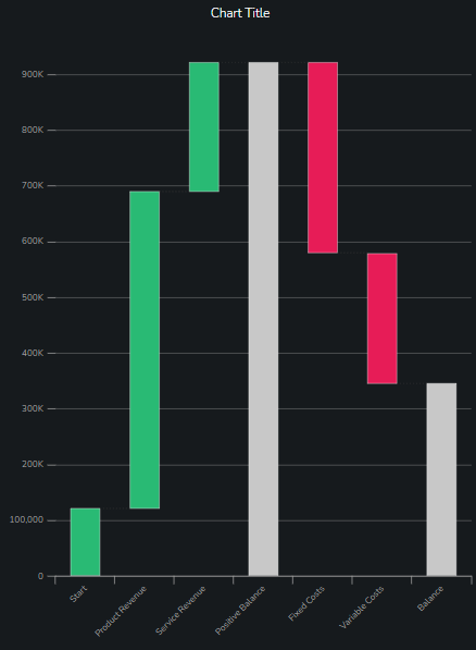
Default to true for both axes (i.e. visible)
Enable Animation
A flag that determines whether the chart will animate points in the chart when data changes.
Data Label Type
Data labels are numeric annotations which are positioned either inside of bars in the chart. The Data Labels property accepts any of the following values, which determines what information to show in data labels:
none: No data labels will be displayed in the chart.deltas-only: Display a data label for each delta bar.sums-only: Display a data label for each summation bar.all: Display a data label for each bar in the chart.
Defaults to none.
Data Label Multiplier
Large numbers are somewhat unsightly when shown in a data label. By selecting a multiplier, the value can be abbreviated (e.g. instead of displaying 10000000 in a data label, we can display 10M by choosing M as the multiplier).
Acceptable values:
auto: Choose a suitable multiplier based on the size of each number to be shown in a data label. This can result in a mix of formats for different labels if they differ enough in magnitude.k: Display values in thousandsm: Display values in millionsb: Display values in billionsNone: No multiplier, i.e. always show the full value.
Defaults to auto.
Data Label Size
Determines the font size of the data labels shown in the chart. Acceptable values are small, medium, large, and huge.
Defaults to medium.
Data Label Position
Accepts a string which instructs where data labels should be positioned relative to each bar.
Acceptable values:
directional: Data labels are positioned towards the top of positive deltas (and summations) and at the bottom of negative deltas. When the chart is inverted, positive/negative deltas have data labels on the right/left, respectively.
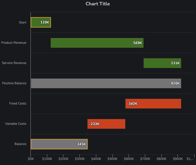
centered: All data labels are placed in the center of each bar.
above: All data labels are placed above (or to the right of, in the case of inverted axes) each bar.
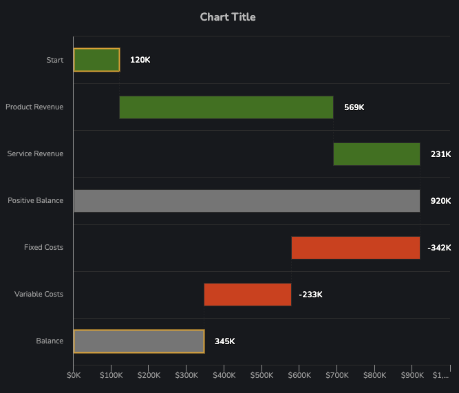
Defaults to directional.
Adaptors
Table to Waterfall Chart
This document will guide you through an example on how to set up the Waterfall-lbt component using the Table to Waterfall Chart adaptor.
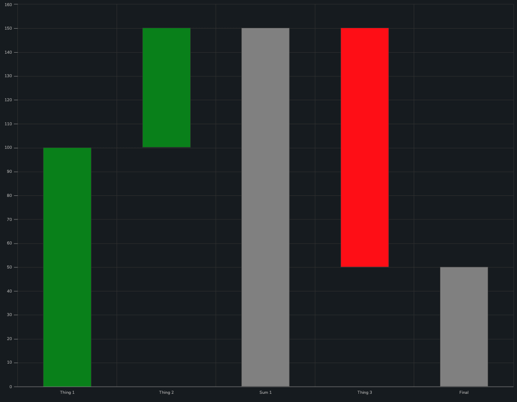
The final result will look like this:
Using the adaptor
The adaptor must receive an SDD (Self Describing Data) object through the Table Data property, which gives information that can be used to construct each bar, and specifies whether a bar is a delta or a sum of all preceding deltas.
The SDD used to construct the waterfall in our example is:
{
  "data": [
    {
      "isSum": false,
      "Category": "Thing 1",
      "NetCashFlow": 100
    },
    {
      "isSum": false,
      "Category": "Thing 2",
      "NetCashFlow": 150
    },
    {
      "isSum": true,
      "Category": "Sum 1",
      "NetCashFlow": 150
    },
    {
      "isSum": false,
      "Category": "Thing 3",
      "NetCashFlow": 50
    },
    {
      "isSum": true,
      "Category": "Final",
      "NetCashFlow": 50
    }
  ],
  "version": "1.0.0",
  "sddFormat": "sdd/table/array-of-objects",
  "validation": "enforced",
  "definitions": {
    "isSum": {
      "kind": "boolean",
      "optional": false
    },
    "Category": {
      "kind": "string",
      "optional": false
    },
    "NetCashFlow": {
      "kind": "integer",
      "optional": false
    }
  }
}
The waterfall chart is able to be constructed when combined with the other adaptor properties:
Category Keyis linked to"Category"- This column in the data is used to construct the labels below each bar in the waterfall
Value Keyis linked to"NetCashFlow"- This column in the data is used as a "running total" of the value used to construct the bars. Note that you do not need to provide the deltas; the adaptor derives them from changes in the values in this column.
Is-sum Keyis linked to"isSum"- This column is a boolean
Note that each row in the SDD provided to the Table Data property results in a bar in the chart.
Note that when a row with isSum=true is provided, the value of NetCashFlow is equal to the previous row. This is required to ensure that the deltas add up properly, as a summation bar has no effect on running total.
(Positive / Negative / Sum) Color
The color of bars can be customized through these properties. In our example we have left them unlinked, resulting in theme defaults being used.
(Positive / Negative / Sum) Border Color
The border colors of bars can be customized through these properties.
Filters
The applicable/available filters in this adaptor are more similar to those found elsewhere in Dais:
Available Filtersmay be linked to an object that maps filter names to filter specification objects. These objects containkey, avalueand a filtermethod.Applicable Filtersare a list of filter names in the object supplied toAvailable Filtersto apply.
The supported values that can be provided to method are:
"equal""contains""between""lt""gt""lte""gte"
An example configuration could be:
{
  "ApplicableFilters": ["MyFilter", "MyOtherFilter"],
  "AvailableFilters": {
    "MyFilter": {
      "key": "key1",
      "value": 50,
      "method": "gte"
    },
    "MyOtherFilter": {
      "key": "key2",
      "value": [90, 180],
      "method": "between"
    }
  }
}
Tooltip Config Map
A mapping between columns in the SDD and a ValueFormatSpec object describing how to display the values in the tooltip.
While there is functionality for defining how values in tooltips are presented that are applied at the chart level, it is also possible to create tooltips for a series that reference other columns in the SDD apart from those that were used to create the areas itself.
This can be achieved by providing a configuration object to the tooltipConfigMap property of a series in this adaptor. This particular object maps columns in the SDD (in this case category, enumValue, percentValue and bigVariableValue) to ValueFormatSpec objects, as described in Appendix 2: Value Format Spec.
{
  "category": {
    "name": "Category",
    "index": 0
  },
  "enumValue": {
    "name": "Dept",
    "index": 1
  },
  "percentValue": {
    "name": "Utilization",
    "useLocale": true,
    "capitalize": true,
    "multiplier": "%"
  },
  "bigVariableValue": {
    "name": "NPV",
    "prefix": "$",
    "useLocale": true,
    "capitalize": false,
    "multiplier": "b",
    "index": 2
  }
}
Note: ValueFormatSpec does not typically include a name property - this is unique to the tooltip configuration for a given column. In this case, name is used to define the bold label shown per row.
In the case where name is not provided, the raw name of the column is used instead.
The index is an optional integer to specify the order of the entries when displayed in the tooltip. When index isn't specified, the entries are sorted alphabetically.
Table to Waterfall Chart (Agg)
The purpose of this adaptor is to perform group-by and aggregation on rows in an SDD table, to construct gross values for each delta category provided in Category Config. The adaptor will then dynamically calculate the deltas between the gross values, which can then be used to make a waterfall chart.
As an example, we will be constructing the following chart using the Table to Waterfall Chart (Agg) adaptor:
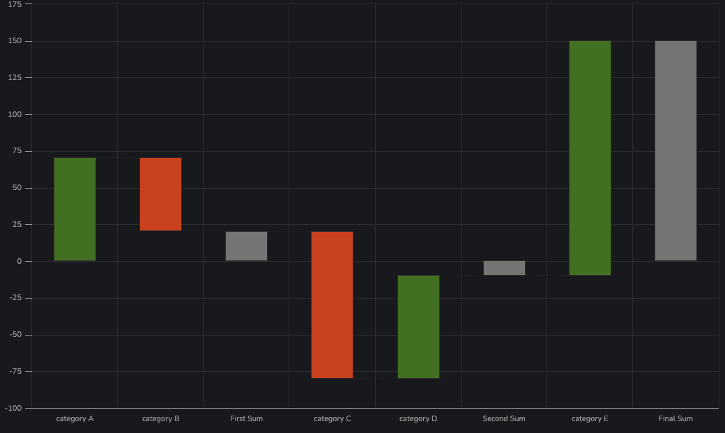
Table Data
This property should be linked to an SDD data source which will be aggregated (see ID Key / Value Key / Aggregation Method) and used to construct the waterfall chart.
In our example, the data used to construct the above chart is given by the following snippet:
{
  "data": [
    {
      "id": "A",
      "value": 100
    },
    {
      "id": "A",
      "value": -30
    },
    {
      "id": "B",
      "value": 10
    },
    {
      "id": "B",
      "value": 10
    },
    {
      "id": "C",
      "value": -30
    },
    {
      "id": "C",
      "value": -50
    },
    {
      "id": "D",
      "value": -10
    },
    {
      "id": "E",
      "value": 100
    },
    {
      "id": "E",
      "value": 20
    },
    {
      "id": "E",
      "value": 30
    }
  ],
  "version": "1.0.0",
  "sddFormat": "sdd/table/array-of-objects",
  "validation": "enforced",
  "definitions": {
    "id": {
      "kind": "string",
      "optional": false
    },
    "value": {
      "kind": "integer",
      "optional": false
    }
  }
}
Filters
Filters for this adaptor work in the same way in the filters described previously: see Filters.
ID Key / Value Key / Aggregation Method
In the above snippet showing our SDD data, we can see that some rows have the same id, and every row has a value. Our intent is to aggregate rows with the same ID (specified by ID Key), and to aggregate their values (specified by Value Key, using the Aggregation Method) to construct the gross values from which deltas can be calculated by the adaptor.
In our example, ID Key and Value Key are simply set to id and value, respectively. Aggregation Method can be set to one of the following:
summean
If no Aggregation Method is specified, it will default to sum. In our case, we are using sum.
Category Config
Category Config expects to be linked to data that instructs the adaptor on how to link ids (by the ID Key) to labels displayed on the x axis, as well as what kind of bar to make.
The configuration used to construct the above chart is given by the following snippet:
[
  {
    "id": "A",
    "kind": "delta",
    "category": "category A"
  },
  {
    "id": "B",
    "kind": "delta",
    "category": "category B"
  },
  {
    "kind": "sum",
    "category": "First Sum"
  },
  {
    "id": "C",
    "kind": "delta",
    "category": "category C"
  },
  {
    "id": "D",
    "kind": "delta",
    "category": "category D"
  },
  {
    "kind": "sum",
    "category": "Second Sum"
  },
  {
    "id": "E",
    "kind": "delta",
    "category": "category E"
  },
  {
    "kind": "sum",
    "category": "Second Sum",
    "category": "The Final Sum"
  }
]
It can be seen that there are two types of elements that can be provided, discriminated by their kind. Objects with a kind of delta are interpreted as such, resulting in a delta bar being made for that category. A summation bar can be inserted at any point by providing an element with kind being sum. Indeed, the order of elements determines the positions of bars in the constructed chart.
Note that the last element in the list should always be a sum. If this is not provided, one will be made automatically, however it will not have a label for the category.
(Positive / Negative / Sum) Color
The color of bars can be customized through these properties. In our example we have left them unlinked, resulting in theme defaults being used.
(Positive / Negative / Sum) Border Color
The border colors of bars can be customized through these properties.
Appendix 1: Value Format Spec
A value format spec (ValueFormatSpec) is a configuration object used in a variety of use cases, which enables creators to customize the way in which numeric values are displayed. Example use cases include:
- Formatting numbers that appear in tooltips
- Formatting ticks on an axis
- Formatting data labels
The configuration items available in a value format spec are defined by the following snippet:
type ValueFormatSpec = {
  prefix?: string
  suffix?: string
  multiplier?: 'm' | 'b' | 'k' | '1' | '%' | 'auto'
  dp?: number
  capitalize?: boolean
  useLocale?: boolean
}
prefixandsuffixare optional strings to display before/after each value, respectively.dpis the number of decimal points to round to, when dealing with floating point values.useLocaledefines whether numbers should be formatted according to the user's locale (as per their browser):- e.g.
10,000,000instead of10000000.
- e.g.
multiplierallows a number to be abbreviated according to the following patterns:- e.g.
mis associated with millions:10000000becomes10M2345000becomes2.36M
- e.g.
%is associated with percentages:0.55becomes55%10becomes1,000%(assuminguseLocaleistrue)
autowill choose an appropriate multiplier on a per-value basis.
- e.g.
capitalizeis a flag that specifies whether the suffix made by a multiplier should be capitalized. Consider the value10000000(10 Million):capitalizebeingtruewill cause the value to be displayed as10Mcapitalizebeingfalse`` will cause the value to be displayed as10m`
All of the above properties are considered optional. If any are omitted, the following defaults are typically applied:
{
  "prefix": "",
  "suffix": "",
  "multiplier": "auto",
  "dp": 1,
  "capitalize": true,
  "useLocale": true
}